‘All students need to know about color is the basic color wheel and complimentary colors. There are many books on color theory; do not waste your time and money’. (Sergei Bongart)
I don’t know this artist, but his quote about the colour wheel is spot on, and something which I find myself doing without thinking these days. Red always compliments green as can be seen in so many portraits painted by many artists. Green is nearly always used as an underpainting before the pink and red tones are painted on of the skin.
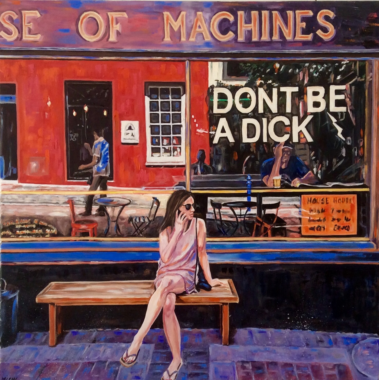
Blue and orange are my personal favourite and I use these colours a lot, as shown here in the front of the cafe. I could have gone for the original brass finish and darker browns and golds, but to me that is too boring. Colour brings life to a painting. These two colours are very Mediterranean and symbolise warmth and sunshine.
Lastly, purple and yellow, again a Mediterranean feel to these two colours. If I need to shade down yellow in one of my works, I rarely, if ever, use brown to provide shade. A touch of purple does the trick.
So this painting is finished and ready to be shipped off to Cape Town gallery, http://stateoftheart-gallery.com once the paint has dried and I can varnish it. As said in previous blog, this gallery is featured in this painting, the red building reflected in the cafe window.
Next week I return to Bristol for a painting of iconic North Street. Watch this space!
If you would like to be kept up to date with what I am doing in the next few weeks, please sign up to my Newsletter at the top of the Home page. I am also on Twitter, Instagram and have a Facebook page called Miche Artist as well as my usual Facebook page.
Sorry, the comment form is closed at this time.